Assailant involved a sophisticated use of programmes
such as Final Cut Pro X and Adobe Photoshop and internet programmes such as Bubble.us and Scribd.
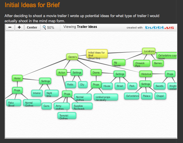 When planning my A2 Coursework I wasn't sure on what task I actually wanted to do-I was undecided between a film trailer and a short film. Therefore I brainstormed ideas on Bubble.us to get my ideas down on paper and review all my options. Bubble.us is useful because it allows idea bubbles to link off from bigger bubbles, meaning that I could put possible ideas within my main ideas, which made deciding a lot easier because it meant I could choose what type of product I produce within the possibility of a trailer or a short film. I also used Scribd to upload my script onto my blog, this is good for documenting my progress throughout the year, for me to refer to if I lose my hard copy of the script and also so audiences can see a preview of what I will produce. I used photoshop to create a mood board which was also a good brainstorming tool, photoshop was also used to plan my poster by analysing other poster through annotations.
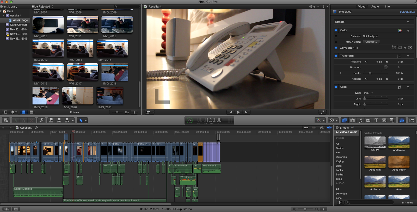
Advanced skills in Final Cut were
especially relevant to the making of my short film; for example, my scenes are
very dark, therefore I had to greatly reduce the shadow in the clips and turn up the brightness to an extent. I also
added a significant blue hue to the clips, this makes it more spooky, cold, and
emphasises the night. I had to use was on-set lighting where the torchlight simply wasn't enough to light up the scene or the torch
would drown out the whole set to just a white light in blackness, therefore I
had to add even more lighting to the scene without turning the lights on.
Therefore I used the light from the camera on my phone to improve the lighting.
It would've been too noticeable and would've created shadow if I had shone it directly
where I was shooting, therefore a lot of the time I would shine it on the wall
behind or to the side where the reflected light would be just enough to improve
the visibility without it looking obvious that extra lighting was used. I also used final cut to make my radio advert; this was a simple process of copying sound effects and moments from my final peace and editing them together as an audio piece, being able to put a soundtrack in the background and applying some narration to it.
Lastly, Photoshop was used to create my posters. When making my movie poster I have to remove lots of background from the images I've taken to make things look more realistic. For example having a man against a black background I need to cut him out of the original picture and insert him in front of a dark background. Photoshop helped to change the tone and the colours of the poster; my original image for the poster was to bright and colourful to match the Horror genre, therefore through photoshop I could make the image a lot darker and more foreboding. I also used cropping to make my film logo which was a variation of J.R.R. Tolkien's famous publishing logo: to make my logo say JP for Jackson Productions I had to crop out the two R's on the logo. This was a nod to J.R.R. Tolkien (As an inspiration to my AS work) whilst keeping the initials to my production name.
Lastly, Photoshop was used to create my posters. When making my movie poster I have to remove lots of background from the images I've taken to make things look more realistic. For example having a man against a black background I need to cut him out of the original picture and insert him in front of a dark background. Photoshop helped to change the tone and the colours of the poster; my original image for the poster was to bright and colourful to match the Horror genre, therefore through photoshop I could make the image a lot darker and more foreboding. I also used cropping to make my film logo which was a variation of J.R.R. Tolkien's famous publishing logo: to make my logo say JP for Jackson Productions I had to crop out the two R's on the logo. This was a nod to J.R.R. Tolkien (As an inspiration to my AS work) whilst keeping the initials to my production name.
No comments:
Post a Comment